Project Details
Refreshing Mass Effect 3's equipment screen UI, giving it a more futuristic look and feel.
Role
UI Designer
Tools Used
Figma, Illustrator, Photoshop
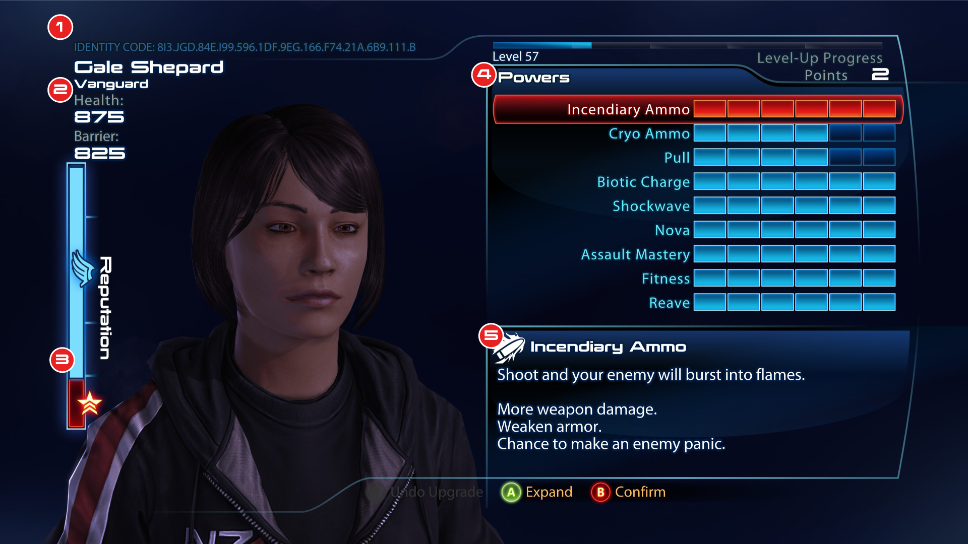
Analyzing Original UI
While the original design for Mass Effect 3's profile screen does its job, there are a few notable things that could be improved to enhance the overall user experience and aesthetic.
1) Overall Design
The design is a bit of a dated take on a futuristic style. Shapes and colours should be adjusted as such to make it feel more futuristic.
2) Type Hierarchy
Type sizes make it hard to distinguish what to look at first and could do a better job of leading the user's eye throughout the screen.
3) Reputation Bar Design
While the reputation bar design in 3 is much easier to look at, it loses the personality and style that was present in the previous games.
4) Awkward Power Layout
This falls under the lack of type hierarchy, but the alignment of text makes the layout look less polished.
5) Overly Detailed Icon
The icons for powers are far too detailed for the size they are at, they should be designed simpler so that they are much easier to recognize.
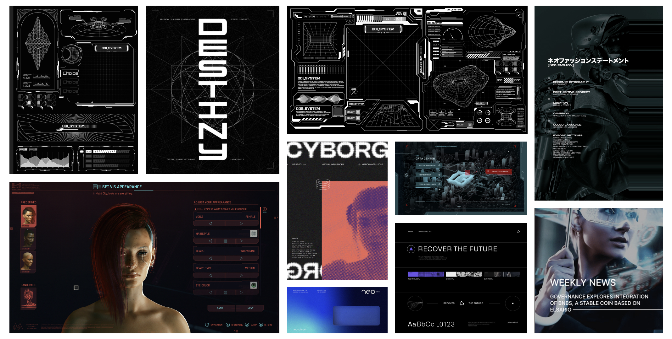
Moodboard
Before jumping into sketching, a moodboard was created to get a better idea on creating futuristic UI, taking inspiration from other games such as Cyberpunk.
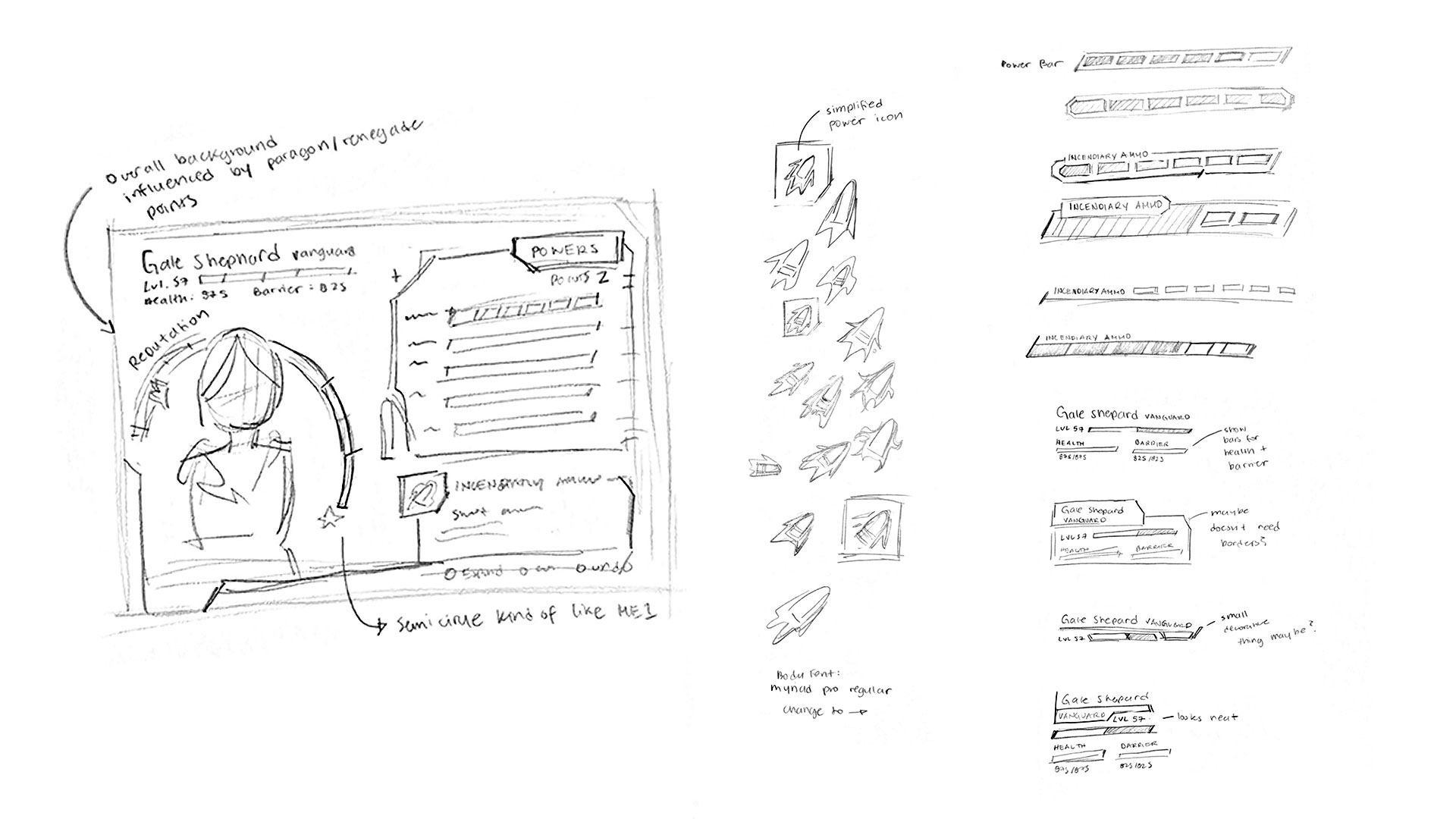
Sketches
Inspired by the images from the moodboard, sketches for the potential layout of the redesigned UI were created. I focused mainly on changing the design of UI elements such as the icons and bars.
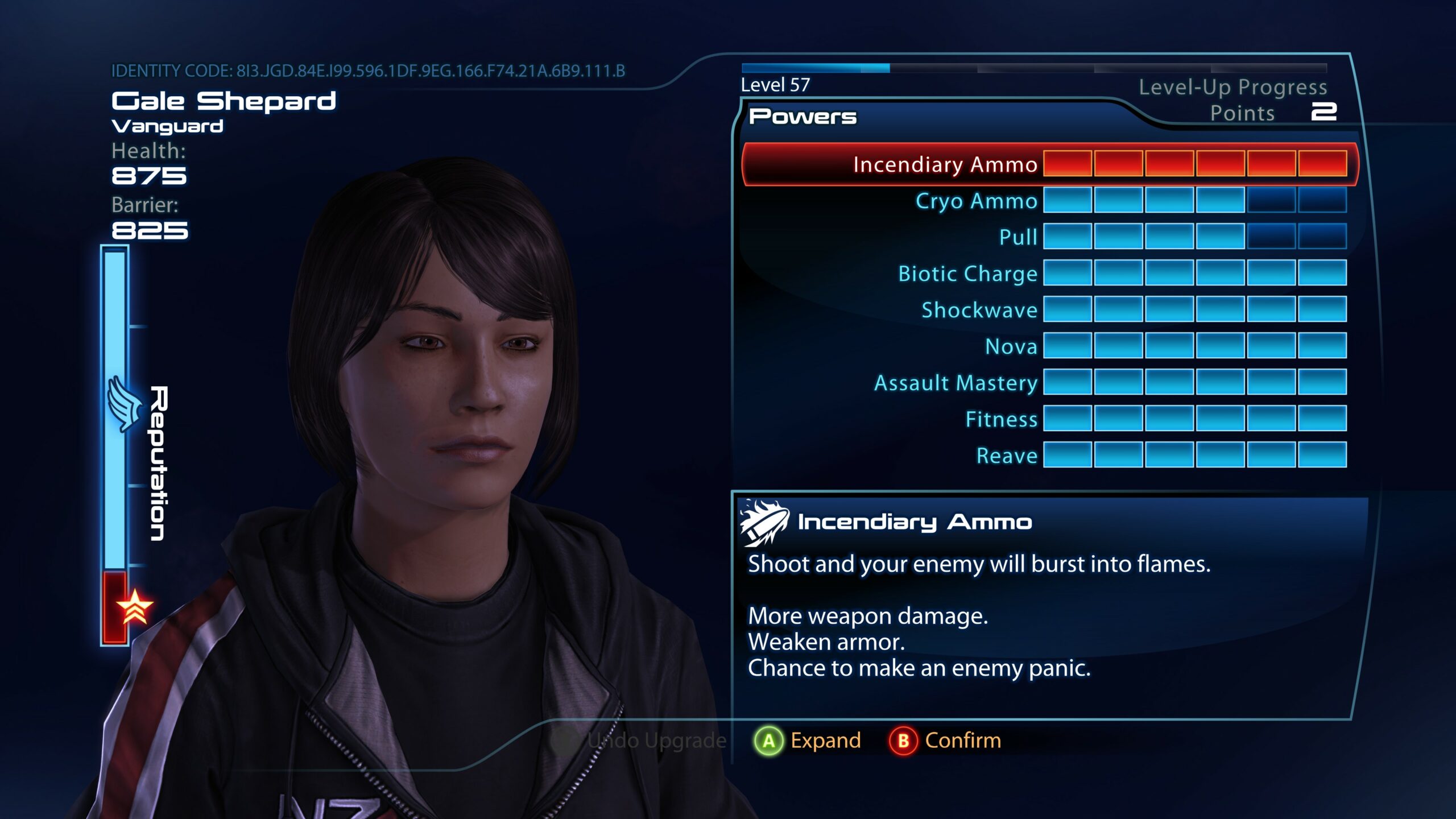
Redesigned UI
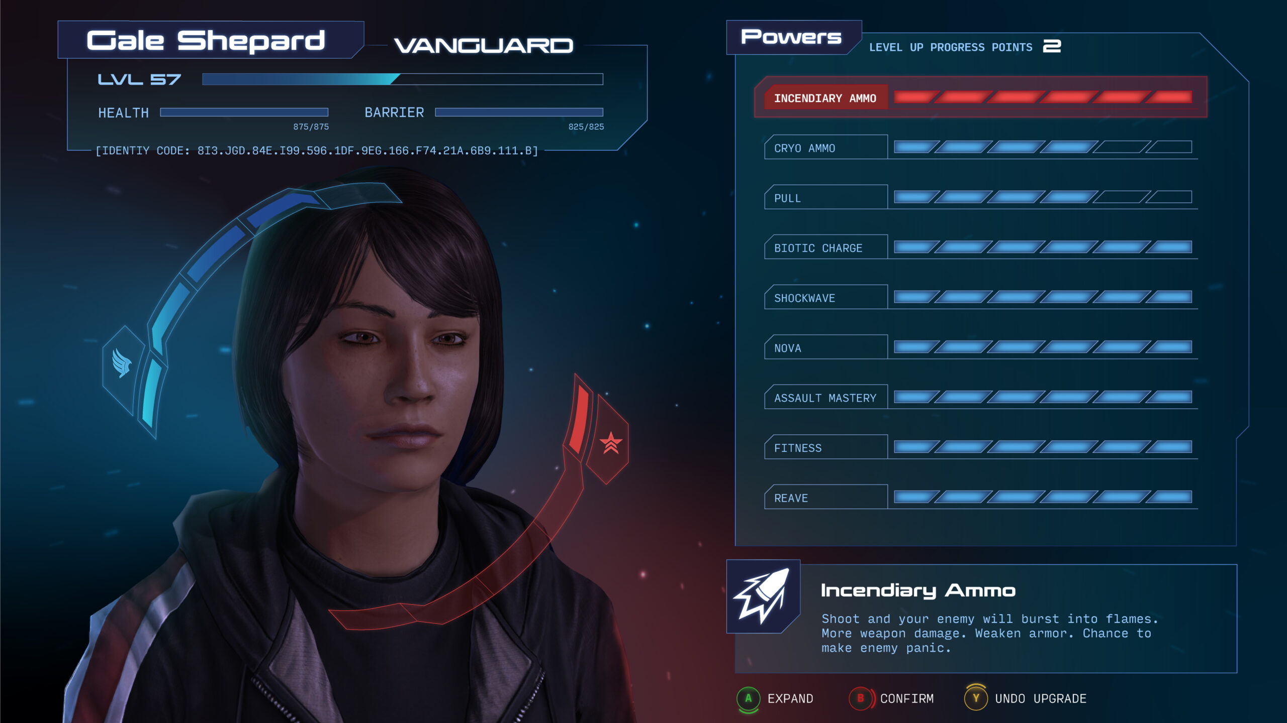
For the final redesign, the organization of information and colour palette did not stray too far from the original, but the icon and bar styles were changed. The most significant change was the Reputation bar, which took inspiration from the past two games while applying a more futuristic style based on the images from the moodboard.
Other smaller elements were added to make the screen more visually pleasing to look at. For example, the background will shift in colour to be more blue or red depending on if the player has more Paragon or Renegade points. Additionally, buttons were given clearer indications based on their placement, taking inspiration from Andromeda's button designs.
Before & After
I'm open to full-time employment opportunities and other creative projects. I look forward to working together on something great!